Description: This trick is not new, but it's always helpful for any people who want to design a docking footer with their Web site. Thank author (Mathew James Taylor) for very good article. Also pass on thank-you words to Mr. Pham Dinh Truong for good workaround with middle layer (see comment below this article).
Please note that you run into same problem even you use table to replace div!

The CSS
The html and body tags
Please note that you run into same problem even you use table to replace div!
When an HTML page contains a small amount of content, the footer can sometimes sit halfway up the page leaving a blank space underneath. This can look bad, particularly on a large screen. Web designers are often asked to push footers down to the bottom of the viewport, but it's not immediately obvious how this can be done.
When I first ditched tables for pure CSS layouts I tried to make the footer stay at the bottom but I just couldn't do it. Now, after a few years of practice I have finally figured out a neat way to do it. My method uses 100% valid CSS and it works in all standards compliant browsers. It also fails gracefully with older browsers so it's safe to use on any website.
See it in action: View my demo with the footer at the bottom
The main features
Works in all modern, standards compliant browsers
Compatible browsers: Firefox (Mac & PC), Safari (Mac & PC), Internet Explorer 7, 6 & 5.5, Opera and Netscape 8Fails gracefully on older browsers
Older non-standards compliant browsers position the footer under the content as per normal. We can't help it if people are using an out of date browser, all we can do is reward people who have upgraded by giving them a better browsing experience through progressive enhancement.Longer content pushes the footer off the page
On long pages with lots of content the footer is pushed off the visible page to the very bottom. Just like a normal website, it will come into view when you scroll all the way down. This means that the footer isn’t always taking up precious reading space.
100% valid CSS with no hacks
The CSS used in this demo is 100% valid and contains no hacks.No JavaScript
JavaScript is not necessary because it works with pure CSS.iPhone compatible
This method also works on the iPhone and iPod Touch in the mobile Safari browser.Free to download
Simply save the source code of my demo page and use it however you like.
There is only one limitation
You must set the height of the footer div to something other than
auto. Choose any height you like, but make sure the value is specified in pixels or ems within your CSS. This is not a big limitation, but it is essential for this method to work correctly.
If you have a lot of text in your footer then it's also a good idea to give the text a bit more room at the bottom by making your footer a bit deeper. This is to cater for people who have their browser set to a larger text size by default. Another way to solve the same problem is to set the height of the footer in em units; this will ensure that the footer grows in size along with the text. If you only have images in your footer than there's nothing to worry about – just set your footer height to a pixel value and away you go.
So how does it work?
It's actually not that complicated. There are two parts to it - the HTML and the CSS.
The HTML div structure
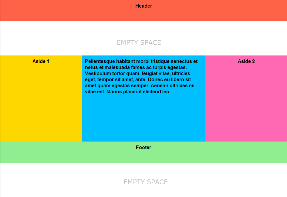
- <div id="container">
- <div id="header"></div>
- <div id="body"></div>
- <div id="footer"></div>
- </div>
There are only four divs required for this to work. The first is a container div that surrounds everything. Inside that are three more divs; a header, a body and a footer. That's it, all the magic happens in the CSS.
- html,
- body {
- margin:0;
- padding:0;
- height:100%;
- }
- #container {
- min-height:100%;
- position:relative;
- }
- #header {
- background:#ff0;
- padding:10px;
- }
- #body {
- padding:10px;
- padding-bottom:60px; /* Height of the footer */
- }
- #footer {
- position:absolute;
- bottom:0;
- width:100%;
- height:60px; /* Height of the footer */
- background:#6cf;
- }
And one simple CSS rule for IE 6 and IE 5.5:
- #container {
- height:100%;
- }
The html and body tags
The html and body tags must be set to
height:100%; this allows us to set a percentage height on our container div later. I have also removed the margins and padding on the body tag so there are no spaces around the parameter of the page.The container div
The container div has a
min-height:100%; this will ensure it stays the full height of the screen even if there is hardly any content. Many older browsers don't support the min-height property, there are ways around it with JavaScript and other methods but that is out of scope for this article. The container div is also set to position:relative; this allows us to absolutely position elements inside it later.The header div
There is nothing unusual with the header. Make it whatever color and size you like.
The body div
The body is quite normal too. The only important thing is it must have a bottom padding that is equal to (or slightly larger than) the height of the footer. You can also use a bottom border if you prefer but a margin won't work.
The footer div
The footer has a set height in pixels (or ems). The div is absolutely positioned
bottom:0; this moves it to the bottom of the container div. When there is little content on the page the container div is exactly the height of the browser viewport (because of the min-height:100%;) and the footer sits neatly at the bottom of the screen. When there is more than a page of content the container div becomes larger and extends down below the bottom of the viewport - the footer is still positioned at the bottom of the container div but this time you need to scroll down to the end of the page to see it. The footer is also set to width:100%; so it stretches across the whole page.The IE 6 & IE 5.5 CSS
Older versions of Internet Explorer don't understand the min-height property but lucky for us the normal height property behaves exactly the same way in these old Microsoft browsers, that is, it will stretch to 100% height of the viewport but if the content is longer it will stretch even further. We simply expose this 100% height rule to Internet Explorer only by using IE conditional comments. View the source on the demo to see how this is done.
So there you have it... A simple, valid way to make the footer get down! I hope you find it useful.
2 nhận xét:
Another problem: Middle layer doesn't stretch height to fill remaining space extended to the top of footer.
You can see it if draw the bottom border beneath the middle layer:
#layout-body {
border-bottom:solid 1px red;
}
You can see the screenshot here:
http://s21.postimg.org/voheivbpj/layout_height_not_stretch.png
So far, I couldn't find any solution to fix this issue. But there is a workaround that is acceptable:
Workaround: Place many new line (BR tag) inside the middle layer. The long enough list of these tags will extend the middle layer to fill the remaining space between header and footer layer.
Happy Coding,
Pham Dinh Truong, Software Engineer,
Đăng nhận xét